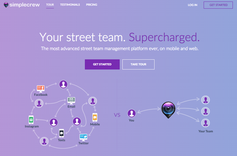
Earlier today, we shipped the latest version of the SimpleCrew website. It’s the culmination of about 6 weeks of labor and love, and while its still a work in progress, it’s our proudest website design yet.
(See it live here: www.SimpleCrew.com)
The SimpleCrew website has been through a good half-dozen or so iterations since the first version back in 2012.
With each update, the site’s improved incrementally – continuously building off everything we learn with each new version.
And man, are we proud of this one!
From the copy to the pages to the images, we wanted to put together a site that would help our visitors understand the benefits and potential of the product in the most powerful way possible.
We designed a new hero graphic (with a heavy hat-tip to Intercom.io) that shows the benefit our product in a simple illustration.
The pages, designs on each, and copywriting on each were thought through to give the clearest and most concise descriptions of the benefits possible.
The new blog design took major inspiration from Medium.com – a site that has designed one of the best reading experiences on the web. Content is a major priority for us going forward, as we look to publishing more helpful articles, essays, and blog posts as ways to deliver more value to current and future customers.
And the rest of the pages throughout the site – we built with readability, clear communication, and beautiful design in mind.
Take a look, and we’d absolutely appreciate it if you shared the new website with folks you know in the music or real estate investing industries. (And we’re sure they’d appreciate it to!)
– Alan VanToai


