Happy holiday’s Crew Nation! A fun little update for you guys…
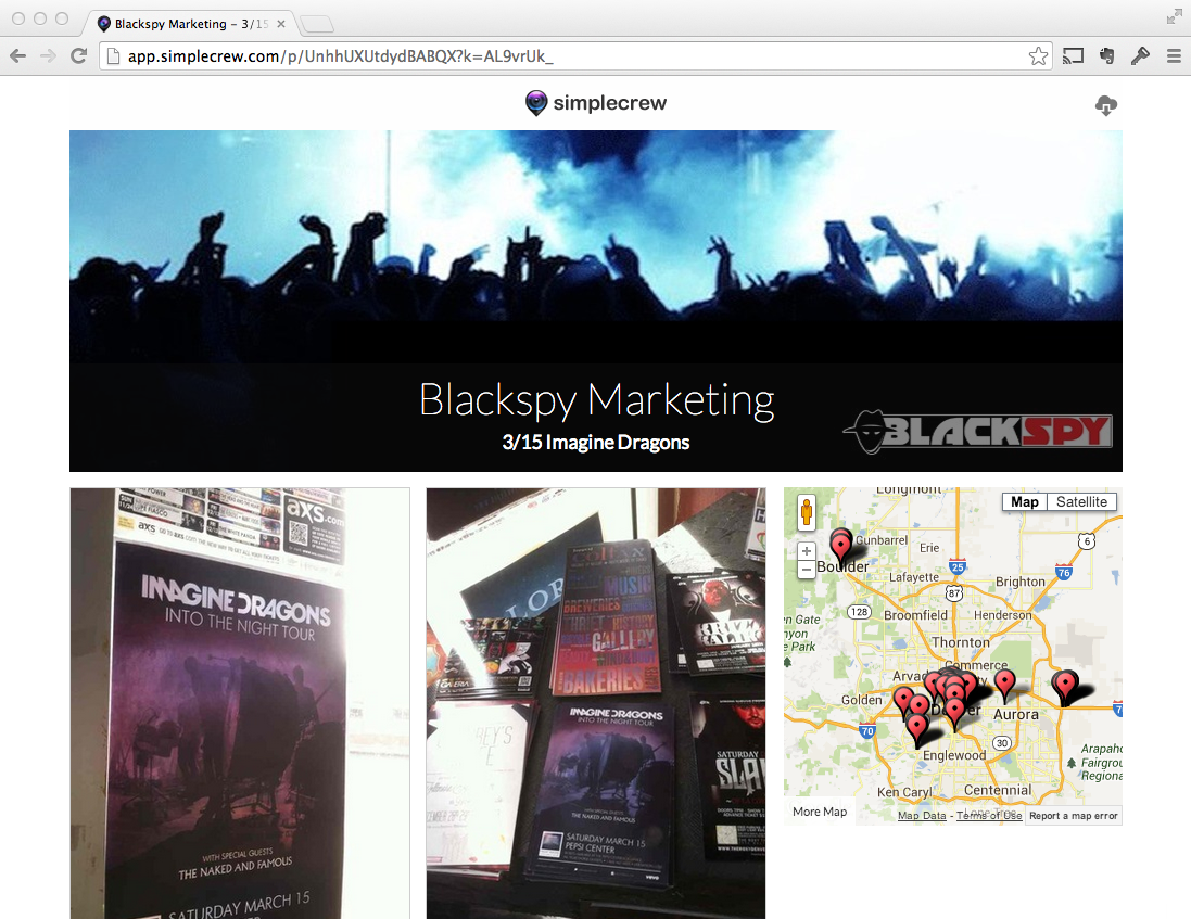
This week, Mike pushed out our new Public Share timeline design for all customers. Check out this example campaign from our friends at Blackspy Marketing. The new design features a sleek new look with a couple key points:

- The re-designed Photo Thumbnails are bigger for easier viewing
- Mouse-over any Photo Thumbnail to highlight the corresponding pin on the map
- New Cover Photos let you prominently display your company or brand
- Clicking on the thumbnails on the map now brings up the pop-up photo viewer
- Download all photos as a .zip archive by clicking the icon in the top right corner
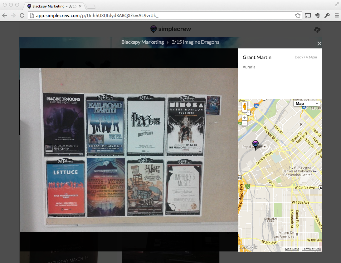
The update also features a redesigned pop-up photo modal that comes up when you click on any thumbnail:

- The new modal includes a map that shows the location of the individual photo
- See who took each photo, the date and the time info, and any comments for every photo
- Use the Left and Right Arrow keys on your keyboard to navigate through the photos (like Facebook)
These changes will start to make their way into the redesign of the entire app that we’ll be releasing in increments over the next few weeks and months. Let us know what you think 🙂
Special thanks to designer Simon Goetz who did a fantastic job working with us to create the new design for the timeline and photo pop-up.
Thanks for reading! Have a Happy New Year – here’s to going big in 2014!


